

Modernize Torq's Visual Identity
Torq was scaling quickly, but the brand hadn’t caught up. The identity felt inconsistent, the typography dated, and the color system didn’t give them a clear signal in a crowded security space. The goal was to fix that and build something that could scale.
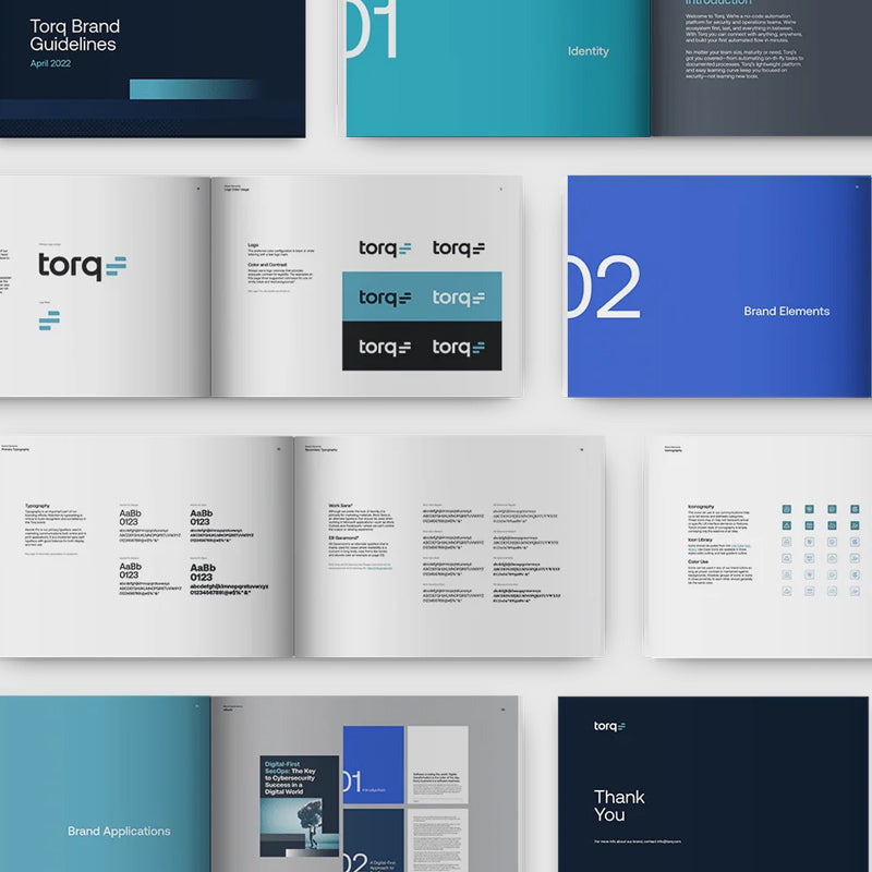
I led creative direction for the evolution and partnered with TurnStyle Studio on the logo and system, while also building a style guide to keep things consistent across product and marketing.
The work focused on three areas. We simplified the typography—removing spurs, tightening proportions, and slightly narrowing the forms to make it feel more modern and controlled. We refined composition—defining spacing, alignment, and proportions so the system holds together across UI, decks, and larger environments. And we focused the color system—working with the CMO and founders to land on a single, ownable electric teal that balances trust with enough energy to stand out.
We rolled the new identity out company-wide in 48 hours.
Over the next eight months, Torq saw 800% revenue growth and 10× customer growth. As of 2026, the company is valued at $1.2B.
If you have any questions, you are always welcome to contact us. We'll get back to you as soon as possible, within 24 hours on weekdays.
-
Shipping Information
Use this text to answer questions in as much detail as possible for your customers.
-
Customer Support
Use this text to answer questions in as much detail as possible for your customers.
-
FAQ’s
Use this text to answer questions in as much detail as possible for your customers.
-
Contact Us
Use this text to answer questions in as much detail as possible for your customers.