Skip to content
  • Home
  • Portfolio
  • About
  • Contact
Login
  • X (Twitter)
  • Instagram
  • LinkedIn
Search
sgehring
  • HomeHome
  • PortfolioPortfolio
    • Design

    • Fine Art

    • Photography

  • AboutAbout
  • ContactContact
Search Login Cart 0
Cart

Your cart is currently empty.

Not sure where to start?
Try these collections:

  • Continue shopping
Spend $1,000.00 more to reach free shipping!
    Order special instructions
    Estimate shipping
    Discount
      Taxes included and shipping calculated at checkout.
      Subtotal
      $0.00 USD
      Recently viewed
      Search
      Home Search Shop 0 Cart Account
      Explore Logo Marks for Mayhem
      Explore Logo Marks for Mayhem
      Explore Logo Marks for Mayhem
      Explore Logo Marks for Mayhem
      Explore Logo Marks for Mayhem

      Explore Logo Marks for Mayhem

      The CMO came to me with a product that needed a mark as sharp as its concept: an AI penetration testing tool that navigates every possible vulnerability route simultaneously, so security teams can trace each path and find every entrance.

      The challenge was finding a symbol that could carry that idea without explaining it.

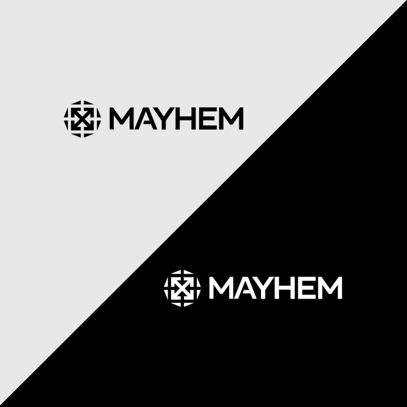
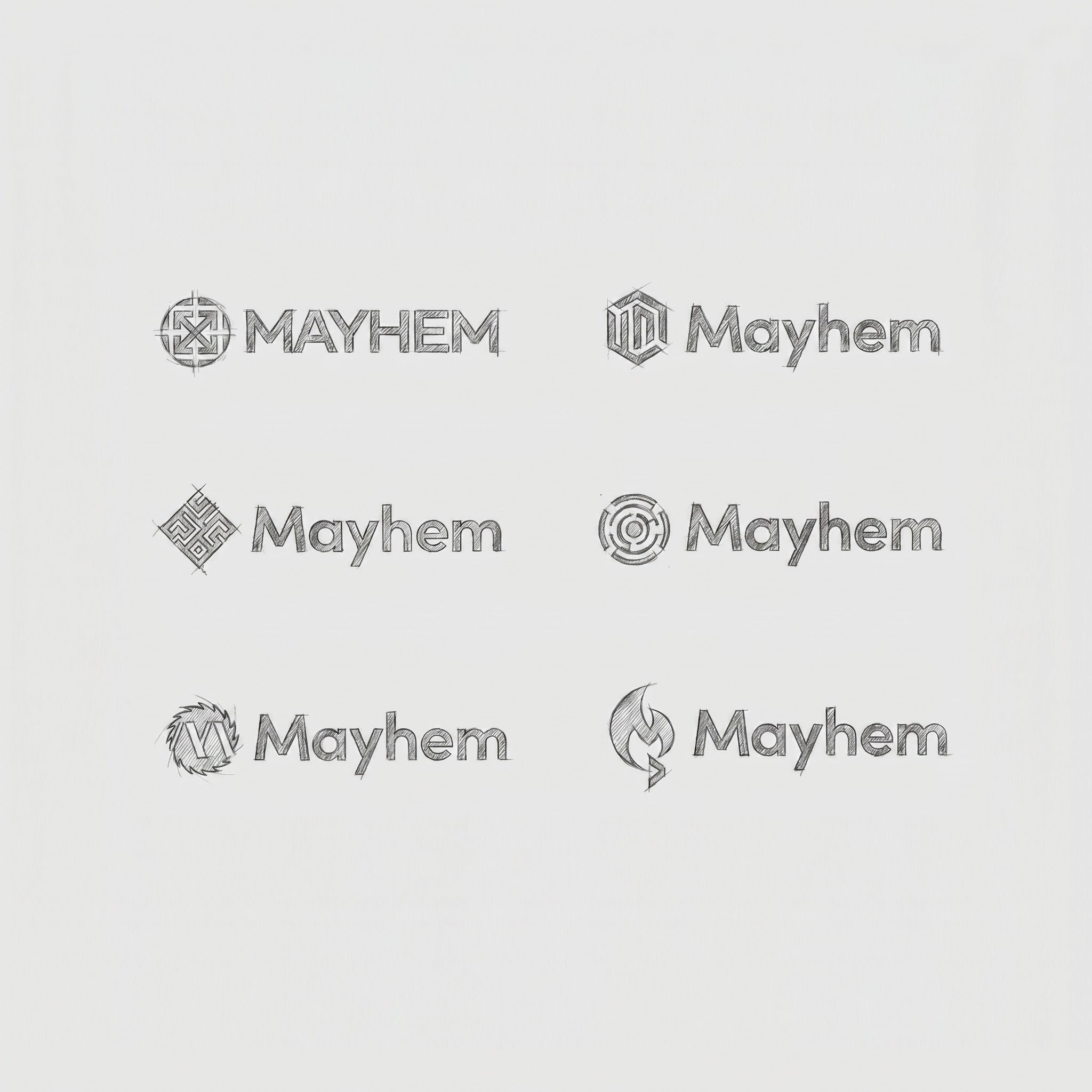
      I started broad — research, sketching across a wide range of directions — before narrowing toward the strongest candidates. The mark we landed on is a stylized riff on the symbol for chaos, but with a maze-like quality that you feel before you name it. What makes it work is the figure-ground tension: positive space pushes outward while negative space pulls inward, a visual metaphor for what the AI is actually doing — probing every direction at once while the paths converge toward entry points.

      Once the mark was locked, I turned to type. I set the wordmark in all caps for legibility and presence across a wide range of applications, then customized the typeface — adjusting the crossbar on the A so the letterforms echo the geometry of the mark and hold together as a unified system.

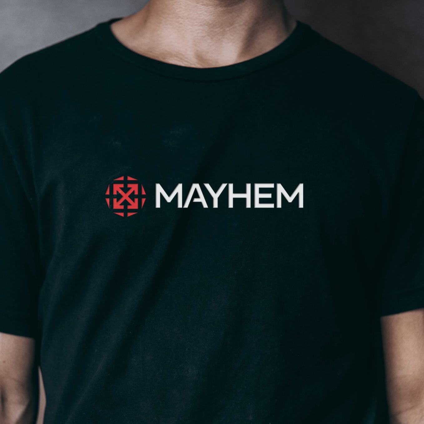
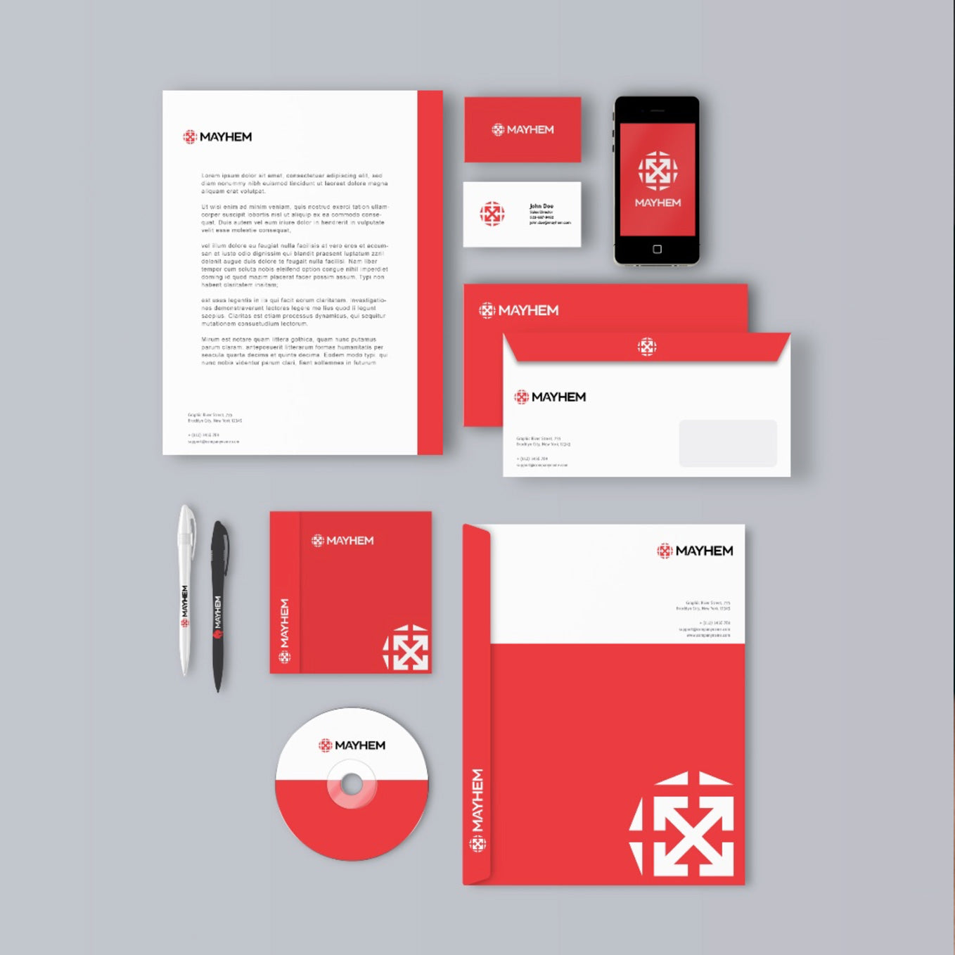
      The final phase was color. I worked with the client to build out a palette and showed how the identity translates across real marking assets, giving them a clear picture of how the brand would live in the world.

      "The best design solutions I've ever found didn't come from a brief. They came after deep reflection — research beyond the obvious, past experiments, honest mistakes, creative writing, painting, drawing, calligraphy, and soft pastels on a coastline. Breakthroughs don't announce themselves. You have to wander far enough to find them."

      WhiteWall Printing & Shipping

      MORE ABOUT WHITEWALL

      Secure payment with shopify

      MORE ABOUT SHOPIFY

      Contact me with questions

      CONTACT ME

      Quick links
      • Design Portfolio
      • Art Portfolio
      • Photography
      INFORMATION
      • Artist Bio
      • Resume
      • Contact

      Stay in the loop with updates

      • X (Twitter)
      • Instagram
      • LinkedIn
      © 2026 sgehring. Powered by Shopify
      • Privacy policy
      • American Express
      • Apple Pay
      • Bancontact
      • BLIK
      • Diners Club
      • Discover
      • EPS
      • Google Pay
      • JCB
      • Maestro
      • Mastercard
      • Multibanco
      • MobilePay
      • PayPal
      • Przelewy24
      • Shop Pay
      • Twint
      • Union Pay
      • Visa
      • Choosing a selection results in a full page refresh.
      • Opens in a new window.