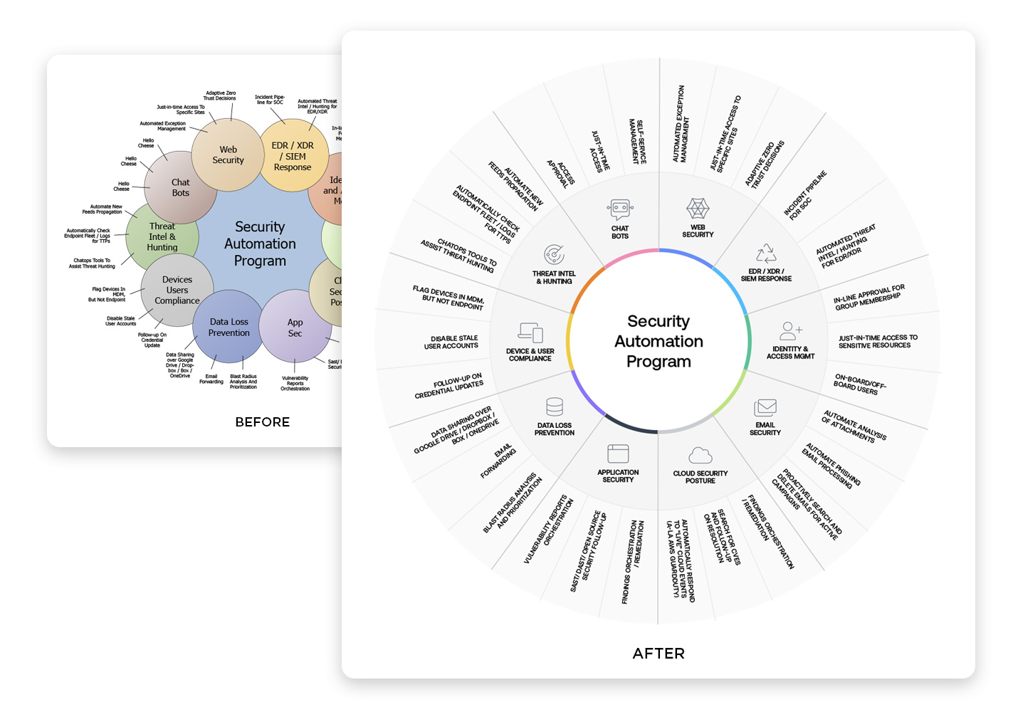
Torq needed a way to show a visual taxonomy for a security automation program. So I went about rethinking the clients draft PowerPoint diagram for use in multiple presentations, eBooks, infographics and other marketing materials.
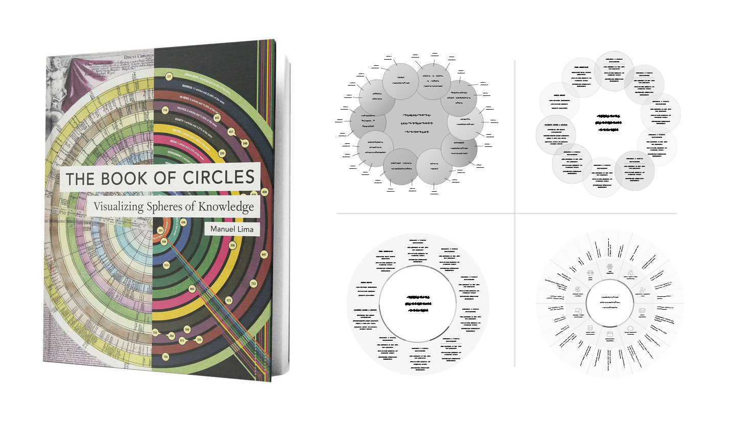
I referenced the “Book of Circles.“ This book documents many circle patterns used in data visualization throughout history. Once I found a pattern closely aligned with the original draft. I did some rapid digital sketching to brainstorm ideas.
Once I had defined direction, I prepared two options for the client. The client and I both did testing to collect feedback. The client used both drafts in one on one presentations with prospects. I used usabilityhub.com and slack to test for a strong preference inside the company.
In the “after” example above, the outcome helped the client tell their overall story in sales presentations and generate further marketing engagement.
