SetLogik Interface Design

SetLogix’s is a startup company that aimed to cleanse “lead contact” data, or prospective customer contact information for marketing teams.

The Goal

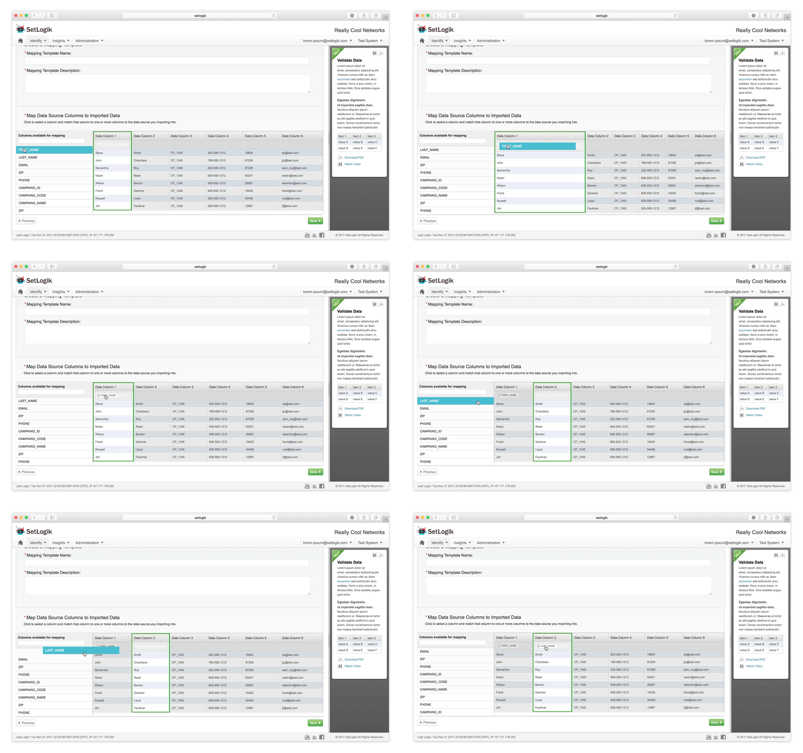
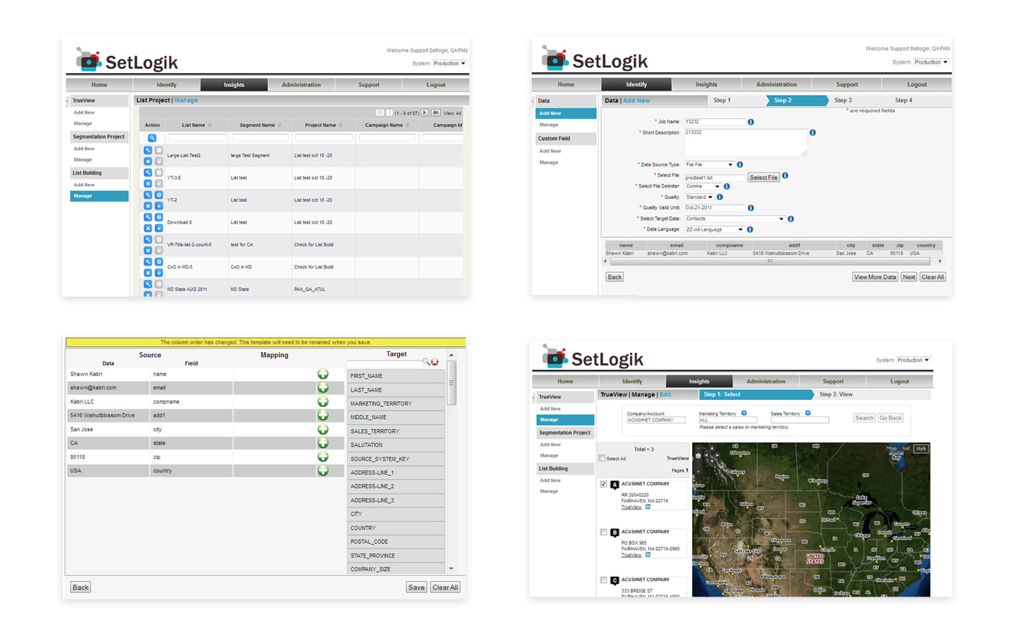
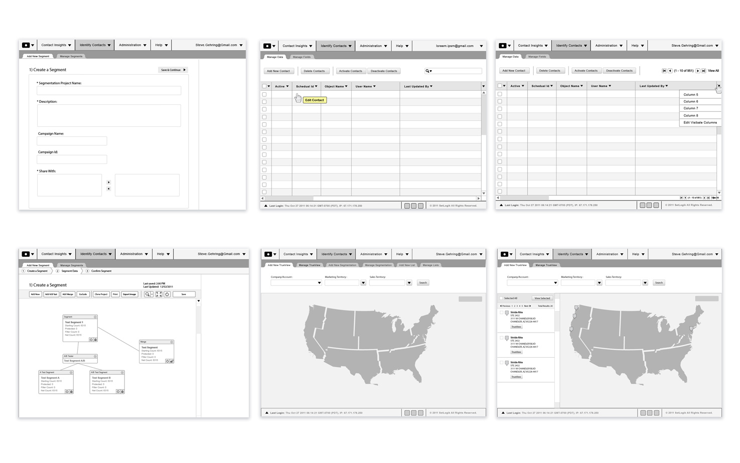
At the start of this project, the SetLogix’s founder gave me a PowerPoint presentation that outlined his application’s functionality. With this information, I transformed the application ideas into structured wireframes, a modern aesthetic and functional prototypes.
Wireframes
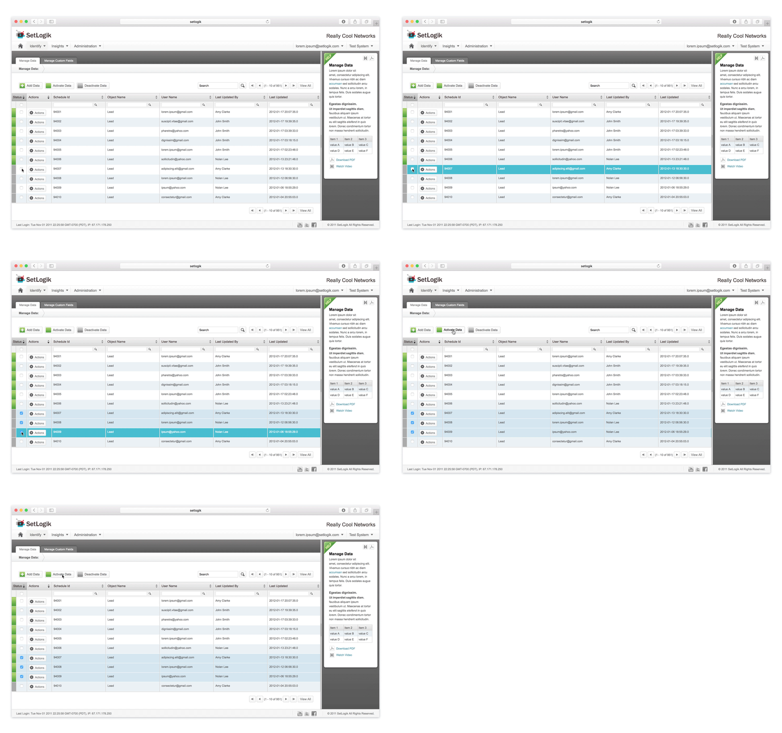
Create primitive prototypes and outline a more intuitive, modern and user-friendly application

  • Opened up more real estate on the main screen through the use of a compact top menu
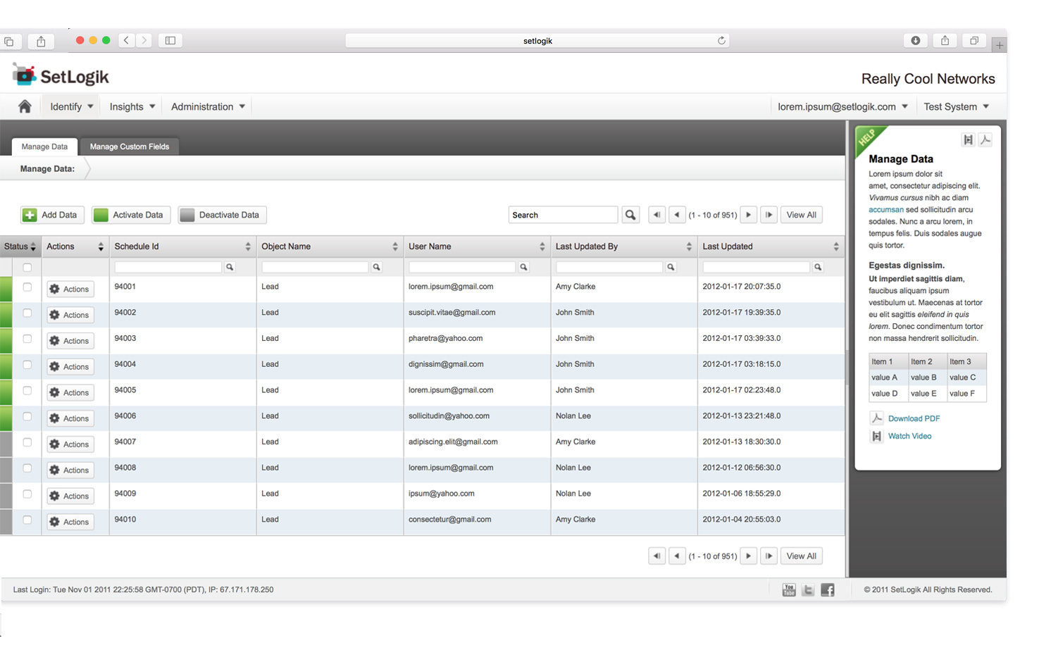
    Designed and recommended features that allowed users to more easily filter, search, sort and perform actions on leads/contacts
  • Researched and outlined a step-by-step upload process that combined features from successful email marketing applications
  • Integrated user data, created filters and a search function that allowed marketers to search for lead contact information based on sales territory

Aesthetic

Applied color, gradients, lines, and icons to modernize the application

  • Used color to label account status
  • Employed neutral tones to unify the menu, tabs and application structure
  • Indicated actionable items with bright green

Front-end Development

Prototyped with CSS and Javascript

Features included:

  • Drop-down menu functionality
  • Modal dialogue boxes
  • Drag and drop features
  • Hover states
  • Tabs
  • Collapsable menus
  • Display options
  • Consistent web aesthetic