
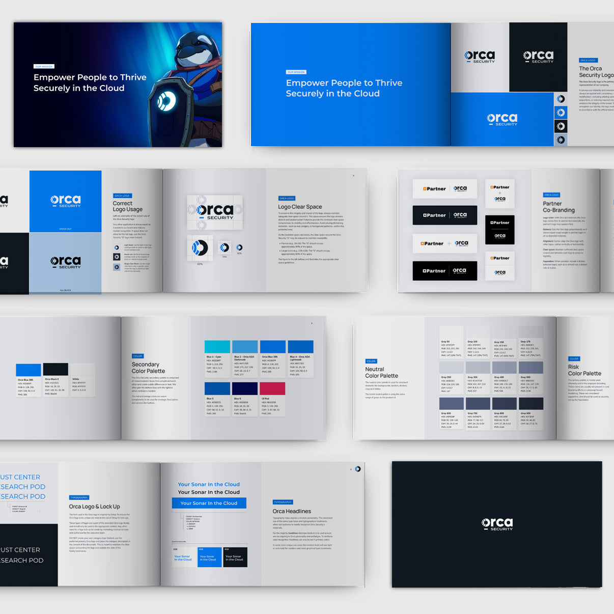
Modernize Orca's Visual Identity
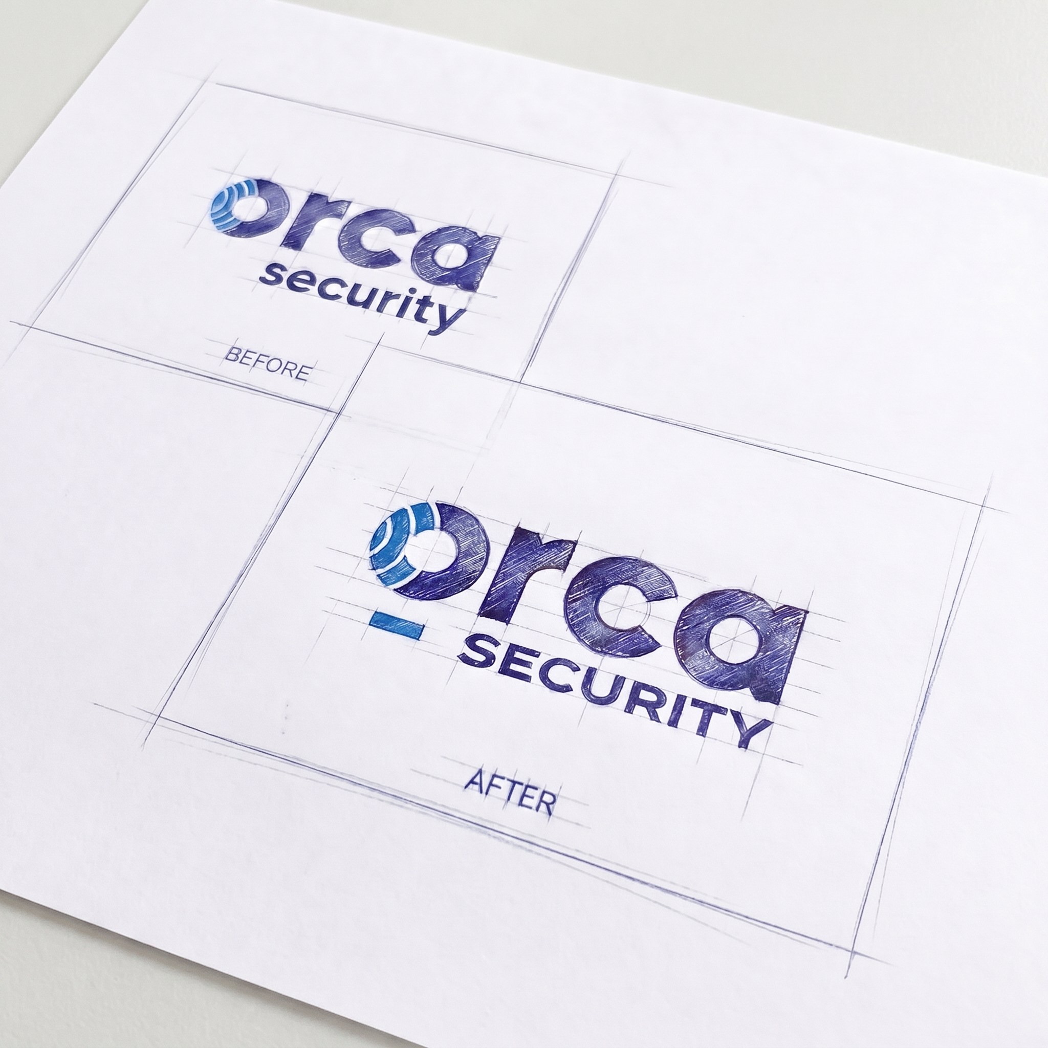
Orca Security had a logo that worked — but only just. The original mark carried awkward negative space around the offset "Security" lockup, making centered layouts and varied aspect ratios a constant fight. In a compressed, icon-dense market — and with a $1.8 billion valuation to back up — it couldn't afford to look provisional.
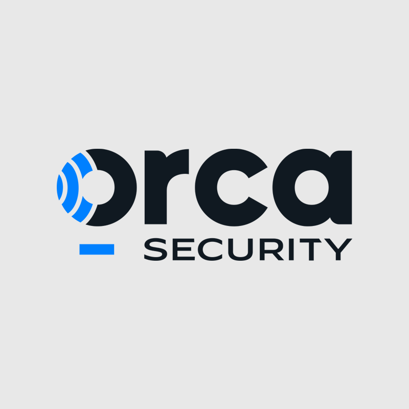
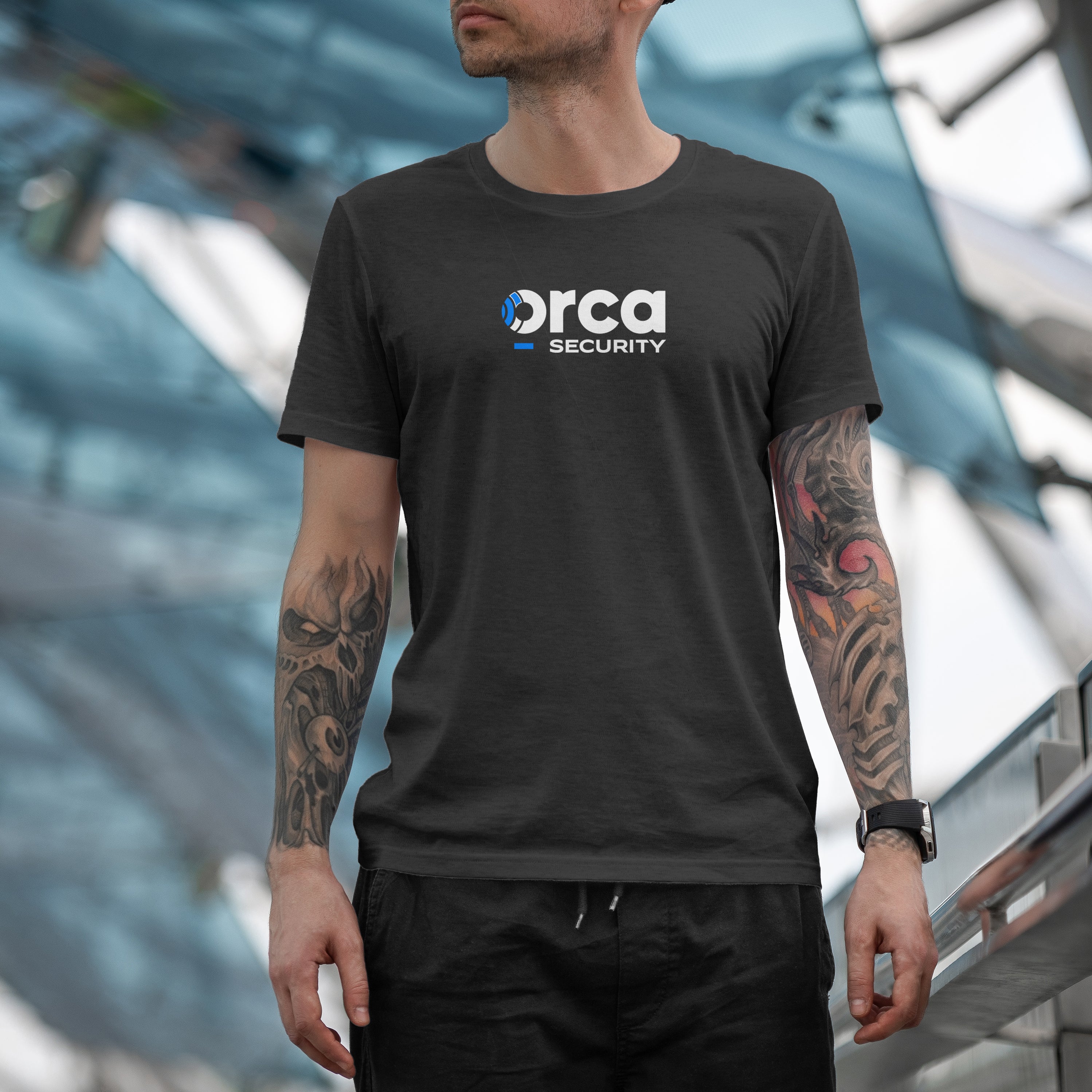
We resolved the balance problem by replacing the offset lockup with a subtle emphasized rectangle beneath the wordmark — a visual period representing the dot in orca.security. The logo now holds in virtually any application, clean and balanced.
Next, we addressed the "Security" typesetting. The original modified Gilroy read as dated and informal. I explored customizations rooted in Swiss modernist precision — tighter proportions, all-caps, improved legibility at small sizes — to match where the company was heading.
Finally, we simplified the ring detail inside the O, reducing noise and improving legibility across sizes.
The result is a mark built to scale alongside a $1.8B cloud security leader — tighter, more balanced, and ready to compete.
If you have any questions, you are always welcome to contact us. We'll get back to you as soon as possible, within 24 hours on weekdays.
-
Shipping Information
Use this text to answer questions in as much detail as possible for your customers.
-
Customer Support
Use this text to answer questions in as much detail as possible for your customers.
-
FAQ’s
Use this text to answer questions in as much detail as possible for your customers.
-
Contact Us
Use this text to answer questions in as much detail as possible for your customers.