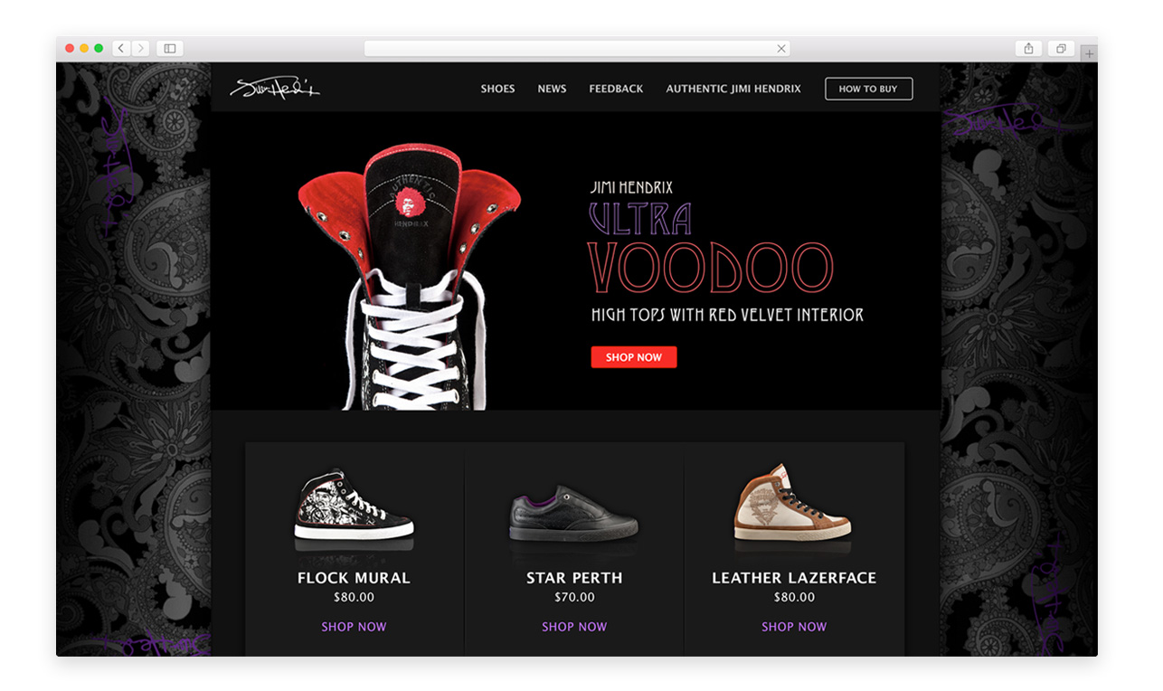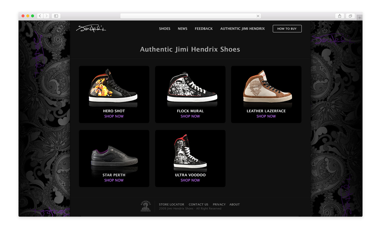
Jimi Hendrix Shoes wanted to test the market with a cost conscious website showcasing its new line of rocker-inspired sneakers.
My vision for this site was to create a canvas on which the colorful shoes could make a statement. I chose a neutral color palette of gray, black and white to contrast with the shoes. I also used the pattern from a sneaker prototype to create a subtle paisley background reminiscent of Hendrix’s personality.
To meet the client’s budget goals, I built the site using a WordPress infrastructure, with a standard home page layout and simple product pages. This allowed the client flexibility to make editorial changes and add features such as a blog.
